If you want the entire background on my exploration of this model and simulation, you can read my writeup of it, or poke around the Github page which has the code for this page as well as a Jupyter notebook that has some more neat graphs.
TLDR though, this is a simulation of a, uhh, hypothetical infection that spread from China to America that aims to explore the question, "how much time does America have to react (by shutting down travel etc.) to the virus arriving?"
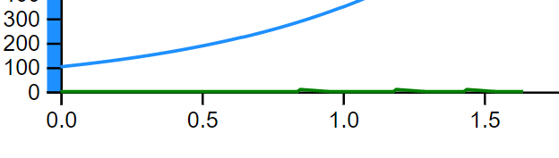
So naturally, we start with an initial infected population in China in blue on the left. Now once the simulation starts, you'll start to see those little blue dots multiplying as the virus spreads among people, and that growth will also be reflected in the line graph below that tracks the case numbers in real time. (I honestly don't know what an appropriate timescale should be for the normal parameters I have set, so let's just say that those tick marks represent numbers of weeks.) A little while into the simulation, you might start to see those little blue dots fly over from China represented in blue on the left flying over by plane to the US in green on the right. While it might look like it, the number of flights is not going to change before travel shuts down, we're just tracking the movement of infected people, and if more people in China are infected, more people on the flights will be infected as well.
One really important part of how this works is what I mean by "overwhelmed". There's a lot more justification as to what and why I call it this, but suffice it to say for this simulation, it's when the infected population in the US is first non-zero/starts growing. For modeling purposes, this is when I declare that the infection has "reached" America (even though of course there were infected people arriving before then), and when the countdown clock starts before travel stops.
However, due to, for lack of a better word, the discretization of the model (we're modelling individual planes at the US at discrete time steps), there are tiny little bumps that represent flights with small amounts of infected people that are quarantined quickly.
Therefore, I had to hack in a bit of an annoying check that was just about equivalent to the original check for the first non-zero infected population. Instead, I actually check for the first time the infected population in the US is non-zero for 10 time steps in a row. I mostly chose 10 just because those little bumps lasted around 9 time steps (so just 1 more to confirm that we we're actually getting our feet off the ground)
The stopping condition is when there are 100k total infected people across both cities, as a way of indicating that our assumption that the pool of infected people was a tiny fraction of the total susceptible population is starting to become invalid.