Homework 0: Penguins
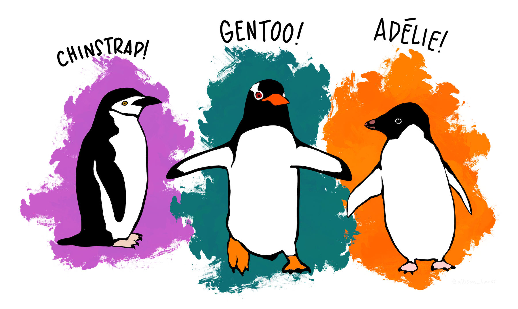
A quick tutorial on PIC 16’s favorite dataset. Image credit to Allison Horst.
Introduction to the Dataset
My penguins-, um, enthused Python professor just gave us this dataset all about penguins! In fact, we had an entire project dedicated to penguins last quarter in PIC 16A… Either way, let’s get started on making a cool dataset visualization about these penguins, and see if we can learn anything just from some pretty plots.
Of course, even though we spend many more hours that I’m willing to admit staring about concentrations of isotopes in penguin blood last quarter, we’d better start by giving an introduction tot he data. In particular, it contains measurements on three penguin species: Chinstrap, Gentoo, and Adelie.
import pandas as pd
url = "https://raw.githubusercontent.com/PhilChodrow/PIC16B/master/datasets/palmer_penguins.csv"
penguins = pd.read_csv(url)
penguins.head()
| studyName | Sample Number | Species | Region | Island | Stage | Individual ID | Clutch Completion | Date Egg | Culmen Length (mm) | Culmen Depth (mm) | Flipper Length (mm) | Body Mass (g) | Sex | Delta 15 N (o/oo) | Delta 13 C (o/oo) | Comments | |
|---|---|---|---|---|---|---|---|---|---|---|---|---|---|---|---|---|---|
| 0 | PAL0708 | 1 | Adelie Penguin (Pygoscelis adeliae) | Anvers | Torgersen | Adult, 1 Egg Stage | N1A1 | Yes | 11/11/07 | 39.1 | 18.7 | 181.0 | 3750.0 | MALE | NaN | NaN | Not enough blood for isotopes. |
| 1 | PAL0708 | 2 | Adelie Penguin (Pygoscelis adeliae) | Anvers | Torgersen | Adult, 1 Egg Stage | N1A2 | Yes | 11/11/07 | 39.5 | 17.4 | 186.0 | 3800.0 | FEMALE | 8.94956 | -24.69454 | NaN |
| 2 | PAL0708 | 3 | Adelie Penguin (Pygoscelis adeliae) | Anvers | Torgersen | Adult, 1 Egg Stage | N2A1 | Yes | 11/16/07 | 40.3 | 18.0 | 195.0 | 3250.0 | FEMALE | 8.36821 | -25.33302 | NaN |
| 3 | PAL0708 | 4 | Adelie Penguin (Pygoscelis adeliae) | Anvers | Torgersen | Adult, 1 Egg Stage | N2A2 | Yes | 11/16/07 | NaN | NaN | NaN | NaN | NaN | NaN | NaN | Adult not sampled. |
| 4 | PAL0708 | 5 | Adelie Penguin (Pygoscelis adeliae) | Anvers | Torgersen | Adult, 1 Egg Stage | N3A1 | Yes | 11/16/07 | 36.7 | 19.3 | 193.0 | 3450.0 | FEMALE | 8.76651 | -25.32426 | NaN |
Neat, so as you might expect, we have each row corresponding to a particular penguin, then we get all its info: species, region, physiological measurements, etc.
For our purposes, we won’t need to worry too much about cleaning (no fancy machine learning yet), but we still need to do just one small step: the species name is currently pretty bulky, so let’s just take the first word.
# replace species with just its first word
penguins['Species'] = penguins['Species'].str.split(' ').str.get(0)
penguins.head()
| studyName | Sample Number | Species | Region | Island | Stage | Individual ID | Clutch Completion | Date Egg | Culmen Length (mm) | Culmen Depth (mm) | Flipper Length (mm) | Body Mass (g) | Sex | Delta 15 N (o/oo) | Delta 13 C (o/oo) | Comments | |
|---|---|---|---|---|---|---|---|---|---|---|---|---|---|---|---|---|---|
| 0 | PAL0708 | 1 | Adelie | Anvers | Torgersen | Adult, 1 Egg Stage | N1A1 | Yes | 11/11/07 | 39.1 | 18.7 | 181.0 | 3750.0 | MALE | NaN | NaN | Not enough blood for isotopes. |
| 1 | PAL0708 | 2 | Adelie | Anvers | Torgersen | Adult, 1 Egg Stage | N1A2 | Yes | 11/11/07 | 39.5 | 17.4 | 186.0 | 3800.0 | FEMALE | 8.94956 | -24.69454 | NaN |
| 2 | PAL0708 | 3 | Adelie | Anvers | Torgersen | Adult, 1 Egg Stage | N2A1 | Yes | 11/16/07 | 40.3 | 18.0 | 195.0 | 3250.0 | FEMALE | 8.36821 | -25.33302 | NaN |
| 3 | PAL0708 | 4 | Adelie | Anvers | Torgersen | Adult, 1 Egg Stage | N2A2 | Yes | 11/16/07 | NaN | NaN | NaN | NaN | NaN | NaN | NaN | Adult not sampled. |
| 4 | PAL0708 | 5 | Adelie | Anvers | Torgersen | Adult, 1 Egg Stage | N3A1 | Yes | 11/16/07 | 36.7 | 19.3 | 193.0 | 3450.0 | FEMALE | 8.76651 | -25.32426 | NaN |
Professor helped me get this table looking a lot better.
I think that looks a lot better already.
Making the Visualization
But now, onto the actual data visualization. I’d like to create a histogram for each species that has in two different colors the frequencies for the Culmen Depths of each sex male and female. That way, we’ll be able to see overall if there’s a significant difference between male and female penguins, and if that difference is consistent across all the species.
First and foremost though, we’ll need matplotlib.
from matplotlib import pyplot as plt
Now let’s create a function that plots two histograms on top of each other. The idea will be to use a groupby and apply later so that we can create this double histogram for each species.
# Overlay 2 histograms to compare them
def overlaid_histogram(data1, data2, n_bins = 10, data1_name=None, data1_color="firebrick", data2_name=None, data2_color="blue", **kwargs):
    # get axes in the standard way
    fig, ax = plt.subplots()

    # create the two histograms
    ax.hist(data1, bins = bins, color = data1_color, alpha = 1, label = data1_name or "")
    ax.hist(data2, bins = bins, color = data2_color, alpha = 0.75, label = data2_name or "")
    ax.set(**kwargs)
    ax.legend(loc = 'best')
I can only use SpeedChat.
Just for fun, we can test this on a single species, say Adelie.
adelie_df = penguins[penguins['Species'] == 'Adelie'] # glad we shortened the species name...
overlaid_histogram(adelie_df[adelie_df['Sex'] == 'MALE']['Culmen Depth (mm)'], adelie_df[adelie_df['Sex'] == 'FEMALE']['Culmen Depth (mm)'],
n_bins=10,
data1_name="Adelie Males",
data2_name="Adelie Females",
xlabel="Culmen Depth (mm)",
ylabel="Frequency",
title="Adelie Gender Culmen Comparison")

I think that looks great. So now, let’s just generalize this in a function, and then run our groupby + apply.
def plot_species_histogram(df):
    species_name = df['Species'].iloc[0]
    overlaid_histogram(df[df['Sex'] == 'MALE']['Culmen Depth (mm)'], df[df['Sex'] == 'FEMALE']['Culmen Depth (mm)'],
    n_bins=10,
    data1_name=species_name+" Males",
    data2_name=species_name+" Females",
    xlabel="Culmen Depth (mm)",
    ylabel="Frequency",
    title=species_name+" Gender Culmen Comparison")

penguins.groupby("Species").apply(plot_species_histogram)


